








A practical guide to responsive design, learn how media queries, flexible layouts, fluid images, and mobile-first thinking make websites work beautifully on every screen size.
Introduction
More than half of all web traffic now comes from mobile devices, smartphones and tablets that display content on screens dramatically smaller than the desktop monitors websites were originally designed for. A website that looks polished on a large monitor but breaks, overflows, or becomes unusable on a phone is not just aesthetically poor, it is failing a majority of its potential audience. Responsive design is the approach that solves this problem: building websites that detect the size of the screen they are being viewed on and adapt their layout, typography, and content accordingly. This post covers the core principles and techniques of responsive design, media queries, flexible layouts, fluid images, and the mobile-first approach, with enough practical detail to start implementing them in your own projects.
What Is Responsive Design? (Simple Explanation)

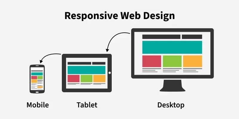
Responsive design is a web development approach in which a website’s layout and appearance adapt fluidly to the size and capabilities of the device displaying it, whether that is a small smartphone, a tablet, a laptop, or a large desktop monitor. Rather than building separate versions of a site for different devices, responsive design uses a single codebase with flexible layouts and conditional CSS rules that adjust automatically. The result is a website that feels native and intentional on every screen, not merely tolerable on mobile and perfect only on desktop.
Why It Matters
Responsive design is no longer a desirable enhancement, it is a baseline expectation. Google uses mobile-friendliness as a ranking factor in search results, meaning non-responsive websites are penalised in search engine visibility. Users who encounter a website that does not work well on their device leave quickly and rarely return. Businesses lose customers, credibility, and revenue when their digital presence fails on mobile. For developers, building responsively from the start is significantly more efficient than retrofitting a desktop-only site for mobile after the fact. Responsive design is the professional standard, not an optional extra.
Key Concepts You Need to Know
The Viewport Meta Tag
The first step in making any webpage responsive is adding the viewport meta tag to the HTML head. Without it, mobile browsers render the page at desktop width and then scale it down, producing tiny, unreadable text and requiring horizontal scrolling. The viewport meta tag instructs the browser to set the page width equal to the device’s screen width and to render it at the correct scale. This single line of HTML is the foundation of all responsive behaviour and should be included in every webpage without exception.
Media Queries
Media queries are CSS rules that apply only when specific conditions are met, most commonly, when the browser window is wider or narrower than a specified threshold. A media query targeting screens narrower than 768 pixels, for example, can change the layout from a multi-column grid to a single column, increase font sizes for readability, or hide elements that are unnecessary on small screens. The pixel values at which these layout changes occur are called breakpoints. Common breakpoints correspond roughly to smartphone (up to around 480px), tablet (up to around 768px), and desktop (above 1024px), though modern responsive design often uses more granular breakpoints based on the specific content rather than device categories.
Mobile-First Design
Mobile-first is a design and development philosophy that begins with the smallest screen size and progressively enhances the layout for larger screens, rather than starting with desktop and then scaling down. Mobile-first is widely considered best practice for several reasons: it forces prioritisation of essential content (because small screens cannot accommodate everything), it tends to produce cleaner, leaner code, and it aligns with the reality that mobile is now the primary browsing context for most users. In CSS terms, mobile-first means writing base styles for small screens and using media queries with min-width conditions to add layout complexity as screen size increases.
Flexible Layouts with Flexbox and CSS Grid
Fixed-width layouts, where elements have exact pixel dimensions, break on screens smaller than those fixed dimensions. Flexible layouts use relative units and modern CSS layout systems to create designs that adapt naturally to available space. Flexbox, introduced in the previous CSS post, handles one-dimensional layouts, rows or columns. CSS Grid is its complement for two-dimensional layouts, simultaneously controlling both rows and columns. Together, Flexbox and CSS Grid give developers powerful, intuitive tools for building layouts that reflow gracefully across screen sizes. Using percentages, the fr unit (fractional units in Grid), and the auto keyword instead of fixed pixel values is key to achieving true flexibility.
Fluid Typography and Images
Text size and image dimensions also need to respond to screen size. Fluid typography uses CSS functions like clamp(), which sets a minimum size, a preferred size that scales with the viewport, and a maximum size, to produce text that grows and shrinks proportionally with the screen without ever becoming too small to read or too large to fit. Fluid images are achieved simply by setting the CSS max-width property to 100% on image elements, preventing them from overflowing their container while allowing them to scale down naturally on smaller screens. The picture element and the srcset attribute allow developers to serve appropriately sized image files at different breakpoints, improving both appearance and performance.
Testing Responsive Designs
Responsive designs must be tested across real devices and screen sizes, not just assumed to work. Browser developer tools include a device simulation mode (toggle it with the device icon in Chrome’s DevTools or with Ctrl+Shift+M) that allows you to preview a page at the dimensions of specific devices. Testing on real physical devices, particularly a range of actual smartphones, catches issues that simulation misses, such as touch behaviour, font rendering differences, and performance on lower-powered hardware.
Common Mistakes or Misconceptions
- “My website looks fine on my phone, so it is responsive.” Testing on a single device is not sufficient. Screens range from 320px wide on older smartphones to 2560px and beyond on large monitors. A design that looks fine on your specific phone may break at other dimensions. Testing across a range of simulated and real screen sizes is essential.
- “Responsive design is the same as mobile design.” Responsive design serves all screen sizes, desktop, tablet, and mobile. Mobile design is a specialised discipline focused specifically on native mobile applications. Responsive web design addresses the full spectrum of screen sizes within a single web-based codebase.
- “Hiding content on mobile solves layout problems.” Using CSS to hide large amounts of content on mobile, rather than rethinking the layout, is a common shortcut that serves users poorly. Hidden content still loads (increasing page weight and load times) and may represent content that mobile users genuinely want. Prioritising and restructuring content for small screens is better than simply concealing it.
Practical Next Steps
Build your responsive design skills with these hands-on exercises:
- Take the HTML and CSS page you built earlier in this series and make it responsive, add the viewport meta tag if not already present, replace any fixed pixel widths with percentages or flexible units, and add at least one media query that changes the layout at a mobile breakpoint. Test the result in your browser’s device simulation mode.
- Complete the Responsive Web Design certification on freeCodeCamp.org, it covers all the techniques in this post through guided projects and culminates in five portfolio-worthy projects built entirely with responsive HTML and CSS.
- Study three websites you use regularly on both desktop and mobile, observe how their layout, navigation, typography, and images change across screen sizes. Identifying and understanding the responsive decisions made by professional teams is one of the fastest ways to develop design intuition.
Key Takeaways
- Responsive design adapts a website’s layout and appearance to any screen size using a single codebase, it is the professional standard, not an optional enhancement.
- Media queries apply conditional CSS based on screen width; breakpoints define the thresholds at which layouts change; mobile-first development starts with small screens and enhances upward.
- Flexible layouts (Flexbox and CSS Grid), fluid typography (clamp()), and fluid images (max-width: 100%) are the core technical tools of responsive design.
- Testing across a range of simulated and real devices, not just your own phone, is essential to catching responsive design failures before users do.
Related Reading
- Previous post: Front-End vs Back-End Development
- Coming up next: Building Your First Simple Website
Call to Action: Subscribe for next week’s final June post, a step-by-step guide to planning and building your first complete website from scratch, bringing together everything covered in this month and throughout the series so far.